
Community Theatre Logo Update
Maplewood Barn Community Theatre wanted a logo update for their 50th anniversary. It needed to indicate the 50th in some way, but be a logo that could be used on merchandise and programs long term. Another reason for the logo refit was that the logo had several variations that were stylistically different, so they needed a brand reset. While creating the logo, I also created an identity guide that will hopefully keep things more consistent in the future.
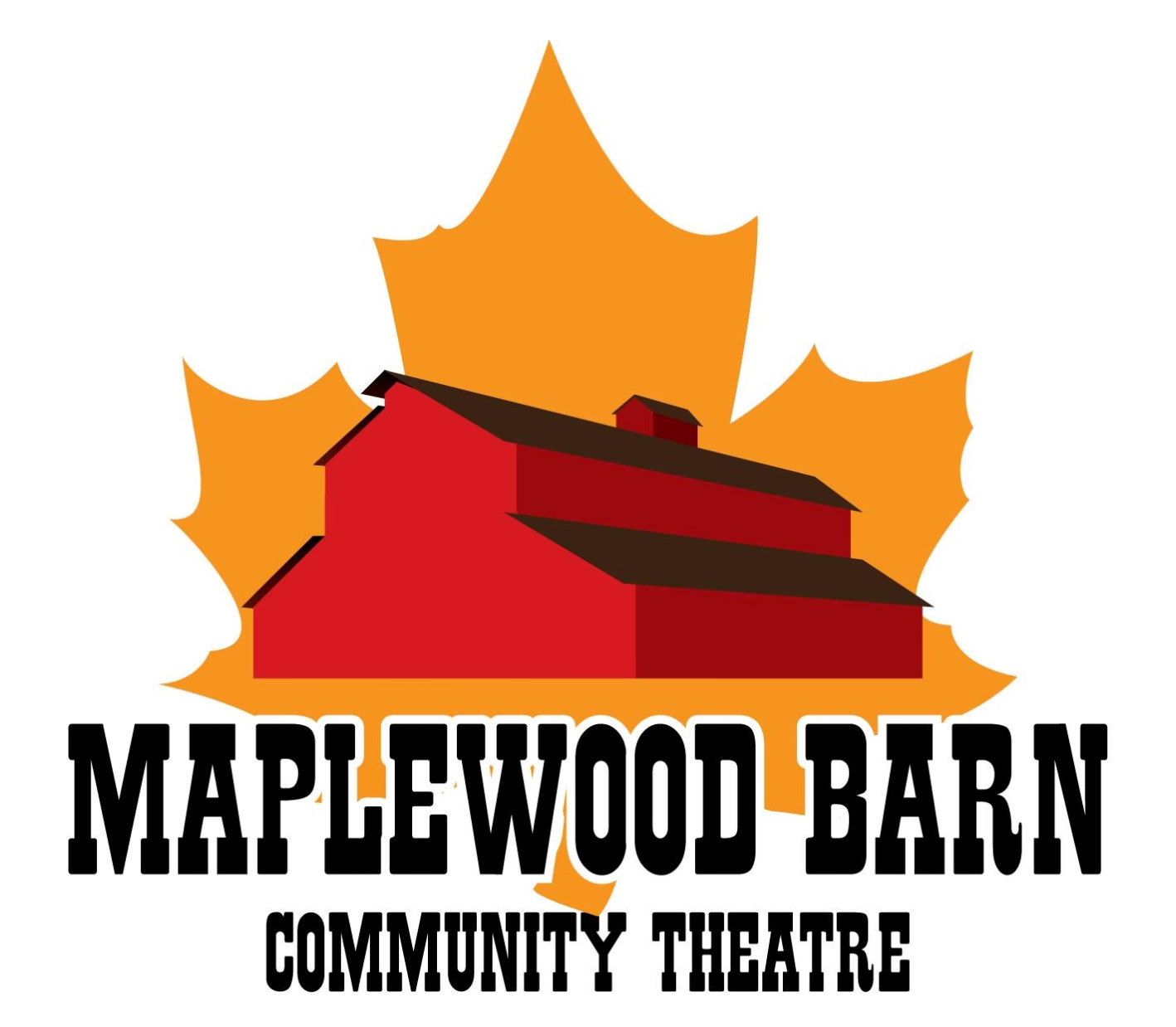
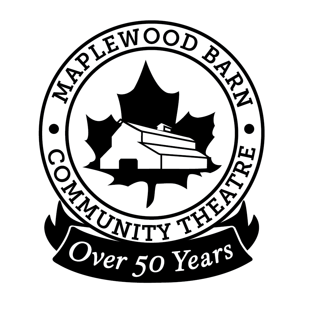
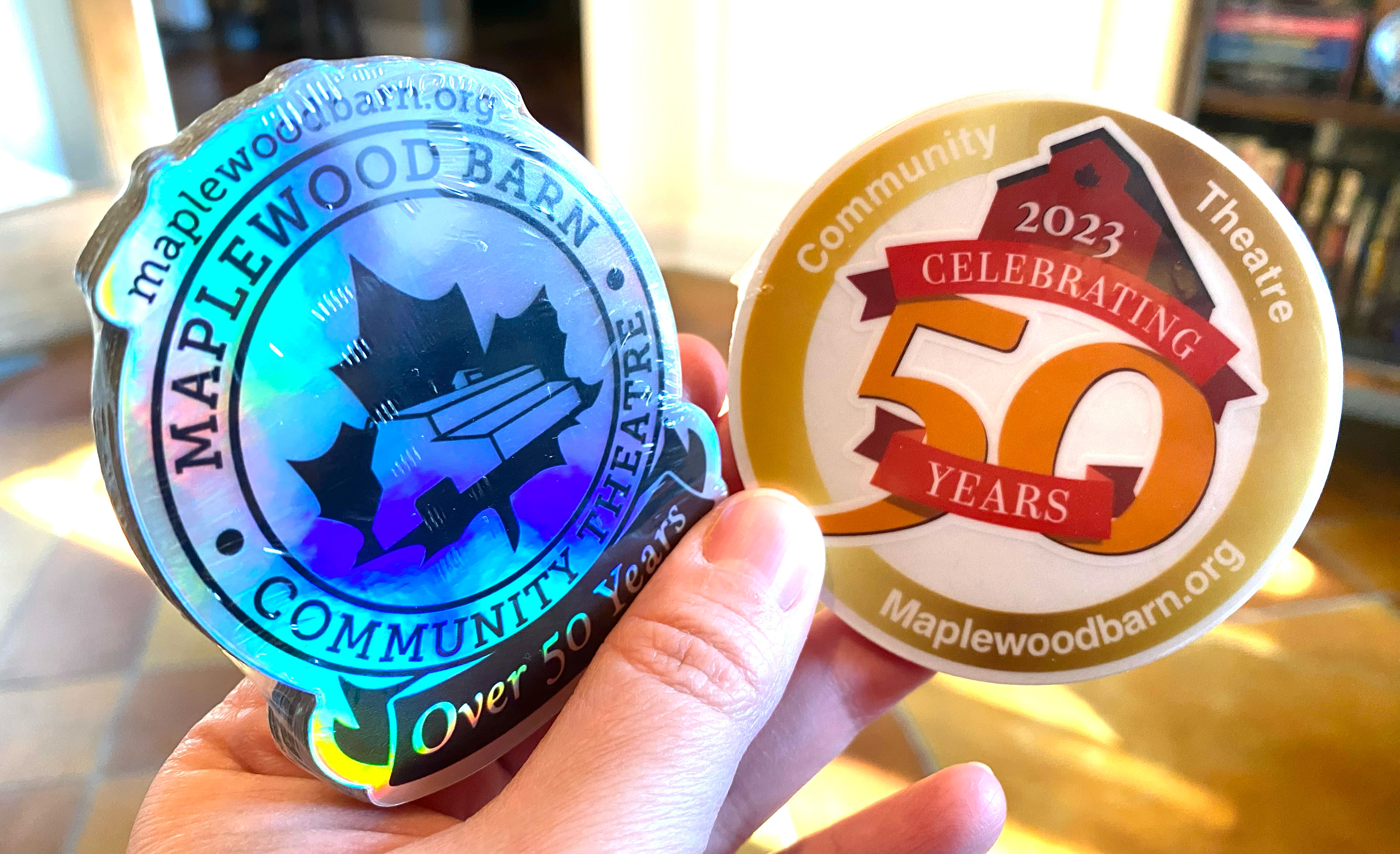
One of the original logos is below on the left. The light and dark versions of the new look are below. They wanted to keep the iconic maple leaf and stick with similar serif fonts. I wanted the "over 50" to be easily removable, in case they decide they don't need it years from now.
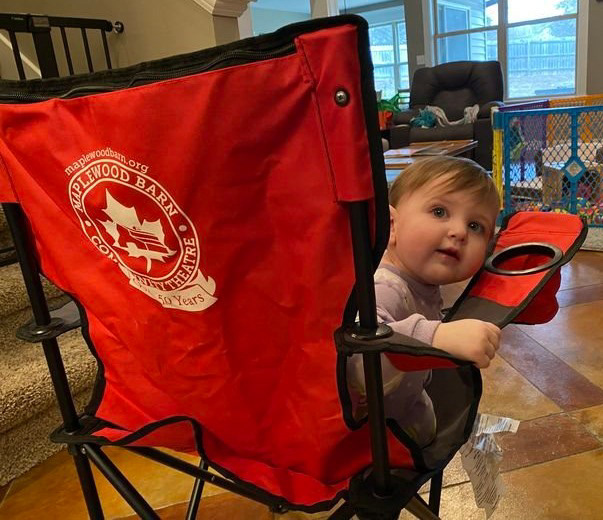
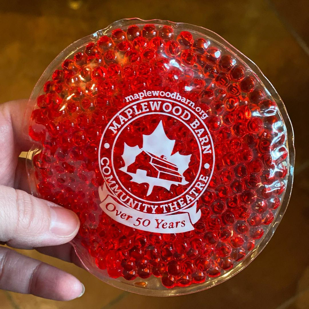
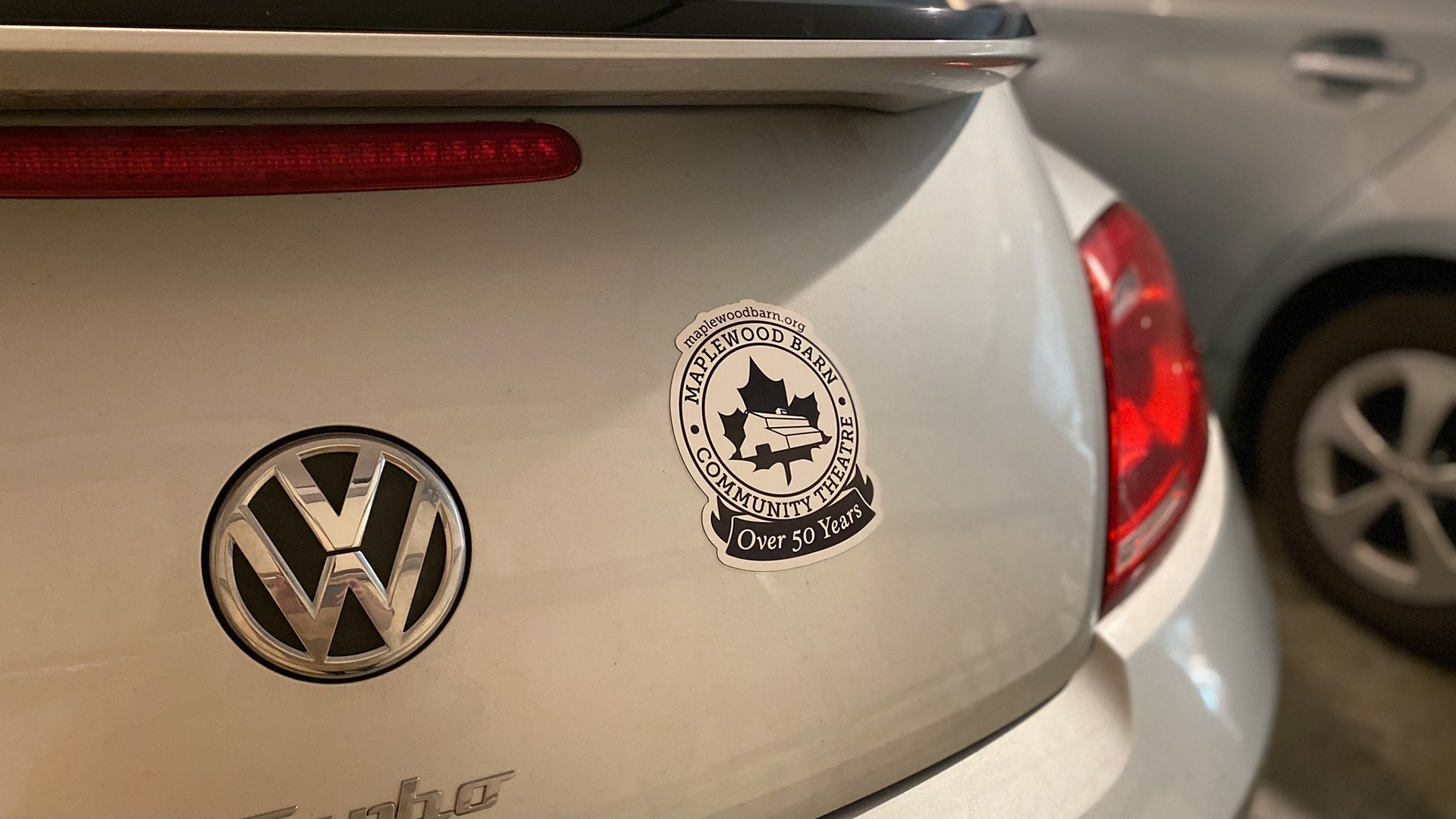
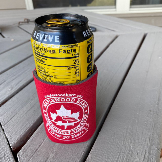
The logo has already been used for a variety of different swag and online content.
I used the same basic design for the season announcements for each show. Each director has a say in what the posters for their show look like, but the season is announced before directors are chosen. The directors then have the option of using them or designing their own.
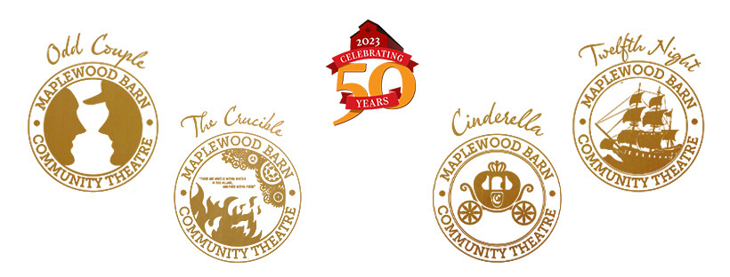
While not directly connected to this rebrand project, I'd like to send a big shout-out to Paul Trani. He designed the full color "Celebrating 50 Years" logo for us during one of his livestreams. We used that and variations on it for all our 50th season specific content and swag. You can see that logo above, in the middle of the gold show badges.
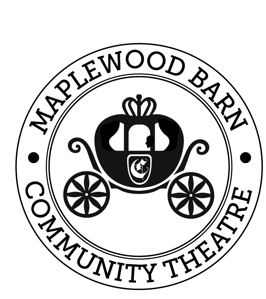
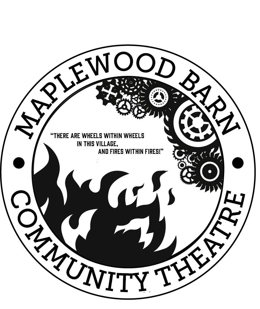
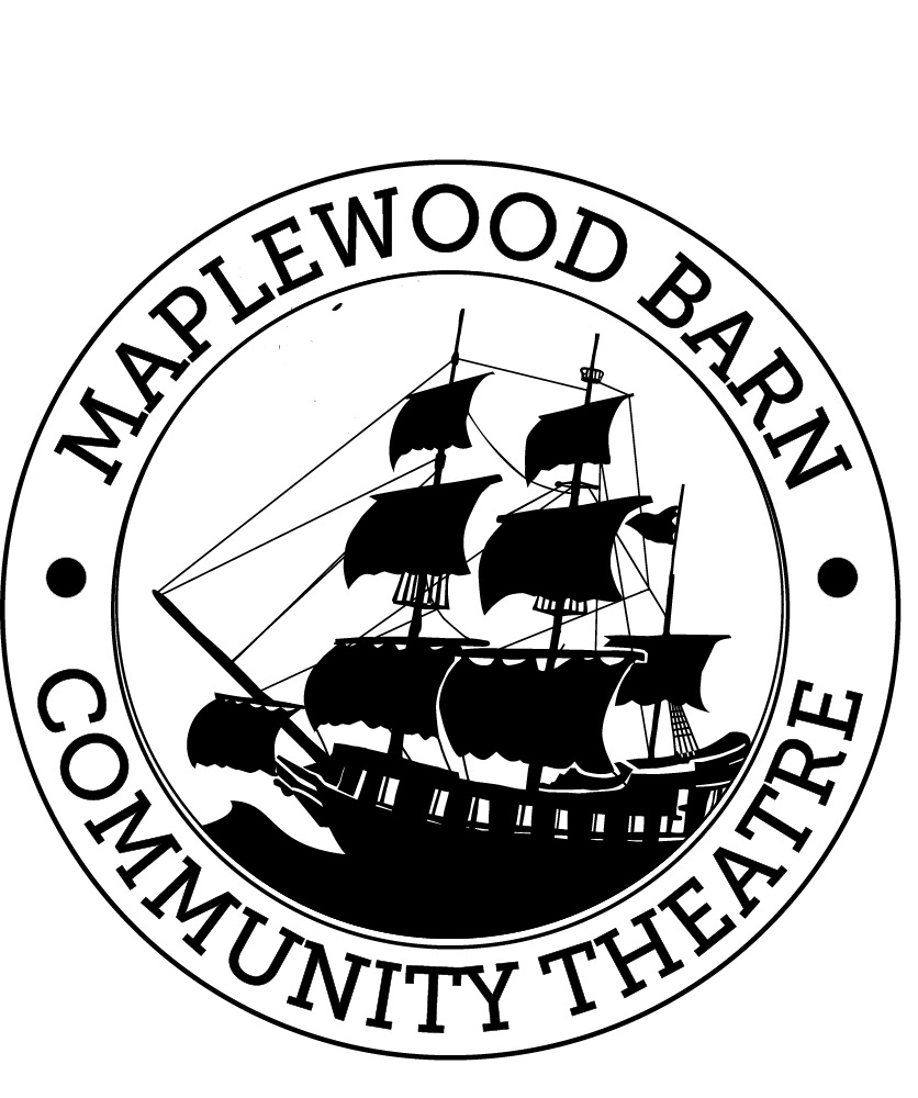
These are enlarged versions of the badges above. Click in to see more detail.